New Rebilly Features: Dashboards, Timelines, and More
We’ve recently launched a new user interface and we’re excited to share the changes with you!
What’s changing?
Our web app (the user interface used by admins, customer service reps, and billing managers), has been rebuilt from the ground up. You’ll notice that information is organized and presented differently, that some features have moved, and that there are new features to explore.
What’s included in the new and improved Rebilly?
The app performs faster, and is built to make it easier to add new features in the future. Some of the features we’ve already added include:

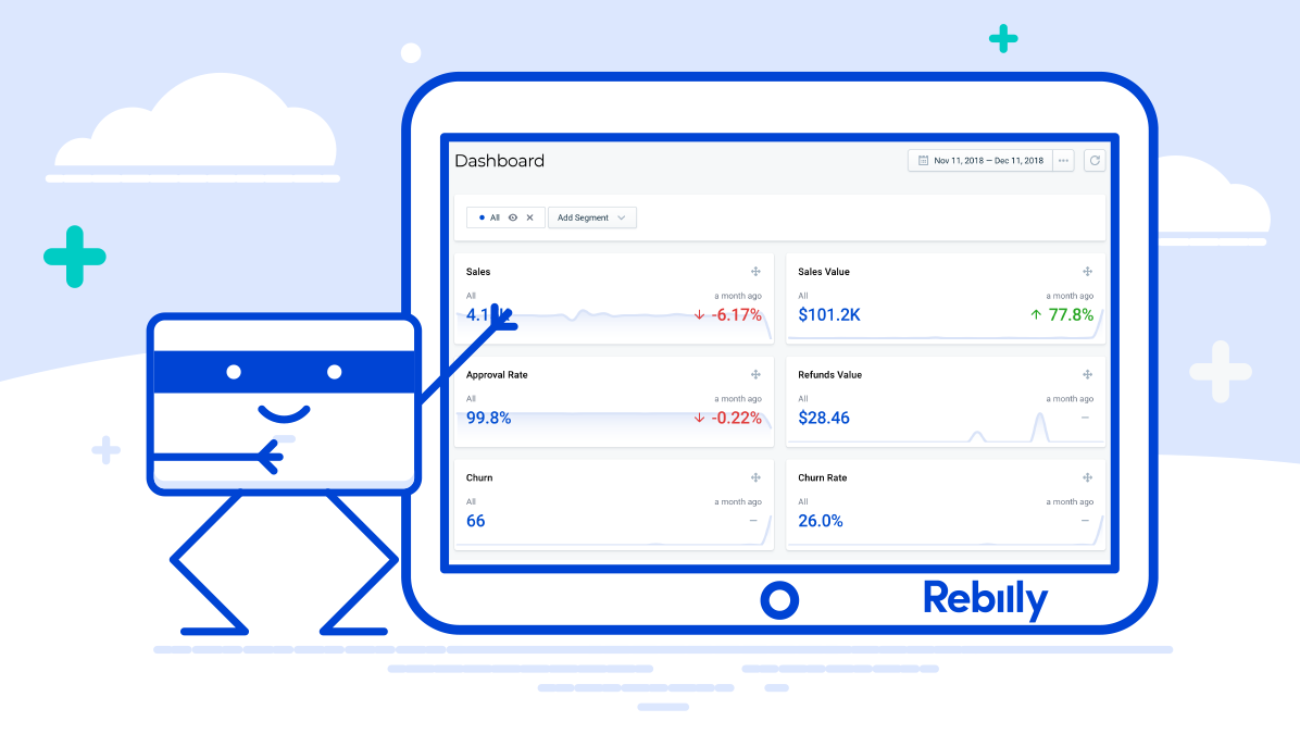
- A new, intuitive dashboard where you can see all of your KPIs at a glance
- The ability to display specific segments on your dashboard (i.e. customers from a specific country, or customers paying with Visa cards)
- Everything on the new dashboard is tile-based, so you can add and move around metrics to customize your view

- A new customer view thats lets you see lifetime revenue, value, and number of payments from customers at a glance (and filter by all of those data-points, or other ones)
- The ability to add and save filtered customer lists (for example, “lifetime revenue equal to or greater than $500”)

- Customer profiles that gives you all relevant information about a customer, including their lead source (both recent and original, making it easy to create data-based marketing plans)
- A timeline on the customer profile that lets you see previous transactions, whether they were approved or denied, and when invoices were sent, along with the ability to comment on the timeline internally (for customer service notes, etc.)
A few other additions include
- An easy way to view all details for customer orders and email invoices directly from the order screen
- New pricing formulas in addition to fixed/flat rate, including stairstep, tiered, and volume pricing (Curious about pricing formulas? Read more here)
- Improvements to our Rules Engine to make it more robust and easier to use
- The ability to copy user permissions from an existing user, making it easy to get your team set up in Rebilly in a few minutes
All of this is on top of the industry-leading features you’ve come to know and love Rebilly for, like our dunning process that lets you focus on finding new customers instead of fixing failed credit cards.
Our planned features include (but aren’t limited to)
- Search
- Shipping zones
- Order-screen timeline
- Additional transaction filters
- Transaction-screen timeline
- Dispute management
Why the change?
Every change we made was with the goal of making Rebilly significantly easier to use. Our team spent a lot of time doing usability research and tests and rebuilt using newer JavaScript libraries. Now, we’ll be able to add new features faster due to better code quality and more modern libraries.
What about the old interface?
If you’re used to the older version of Rebilly, you might need some time to adjust to the new interface. If you want to keep using the older version, you can do that here.
What about my data?
Both user interfaces use the same API, so your data remains safe and secure.
We’ve worked hard, and we hope you like the results!
We’re continuing to work on and improve the new user interface, and add in missing functionality. Please try the new user interface, and let us know what you think. User feedback is what helps us plan new project and features. And as always, thank you for your support!

