Design 101: Creating Visuals for Your Business
Humans are visual creatures. A team of neuroscientists at MIT discovered that the human brain can process entire images that have been caught by the eye for as little as 13 milliseconds. You don’t need to be a neuroscientist to know that this is really, really fast! Significantly faster than what it takes the brain to process text.
Creating effective and engaging content for your audience is hard in our easily-distracted, mobile phone driven world, but embracing the power of design and good visuals in your business can help you do it.
Never been artistically inclined? Don’t have tons of extra time, or the budget to hire a designer? Don’t worry. Creating beautiful designs for your business without breaking a sweat (or your bank account) has never been easier, and we’re here to show you how.
Why is visual design important for your business?
The proof is in the research. According to Hubspot:
- Visual content is 40 times more likely to get shared on social media than any other type of content.
- 20% of people will read a text on a page, but 80% of people will watch a video.
- People can recall 65% of the visual content that they see almost three days later.
You want your audience to be left with a memorable, positive impression of your brand — and design can help you do that. So, let’s get started on taking you from design newbie to design expert. No Photoshop skills or graphic design certificate required!
Use cost-effective customizable templates and tools
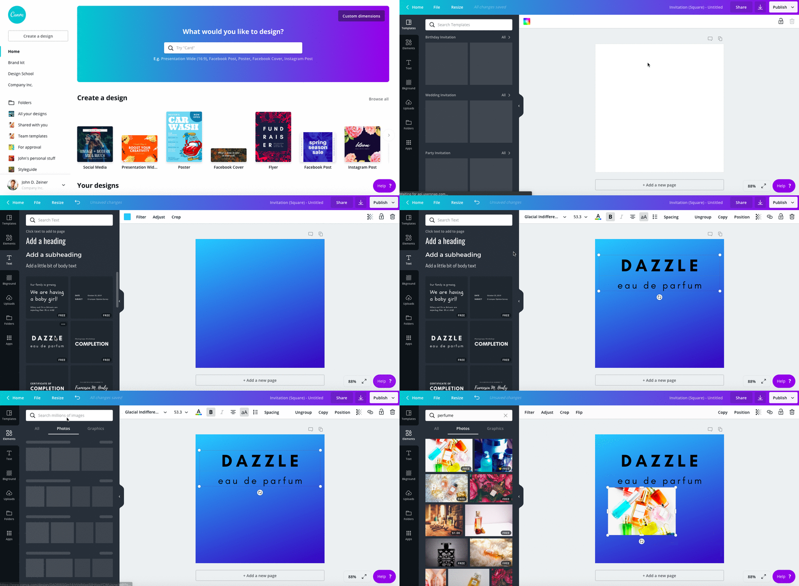
Canva
Canva is the not-so-secret, secret weapon of many business owners. It’s an easy to use, one-stop-shop for nearly all of your design needs.
This free platform offers a variety of content template types, ranging from social media ads and banners to ebook covers and infographics. The great thing about this website is that you don’t ever have to start at zero when creating your next marketing masterpiece. You can simply drop your info into a pre-set design or use it as inspiration when customizing one to perfection.
Canva can be very intuitive and easy to navigate, even for absolute beginners. They also have a great Getting Started Guide if you want more in-depth information.
Animoto
Animoto is a comprehensive video creation tool that offers customizable templates and pre-cut footage. No need to break out the old camcorder or hire an entire film production crew.
Similar to Canva, you can select a pre-designed template or start from scratch. This tool gives you the option to drag and drop photos and video clips right into your project. You can personalize your video by adjusting colors, fonts, and music.
Animoto is free to use, but they will add a watermark when you download your video to share. For a watermark-free, higher definition video and additional features and stock footage, they have plans starting at $33/month. Which can truly be worth the cash if you’re creating engaging content like this:
Giphy Gifmaker
Giphy Gifmaker is here to deliver on all of your GIF needs. A GIF, or Graphic Interchange Format, is a very commonly used animated graphics file. You’ve most likely seen them used on social media, blog posts, or various reply sections. Giphy not only has a vast library of audience favorite GIFs, it also gives you the opportunity to create your own. Giphy pre-made canvases to choose from, or you can easily create your own using images and videos you already have.

Pixlr
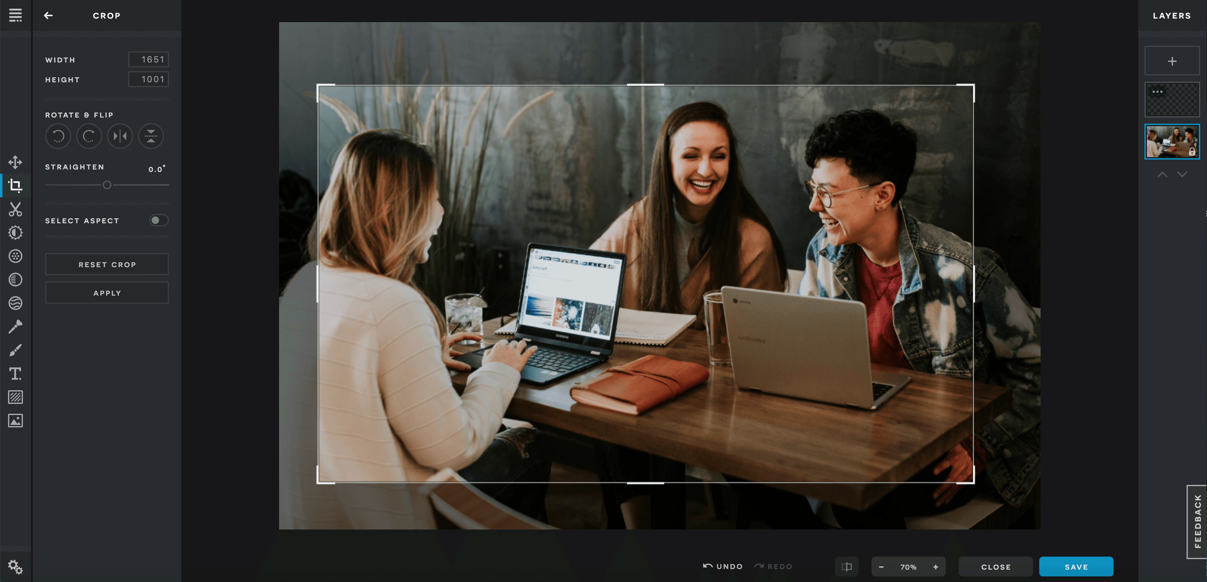
Pixlr makes photo editing a breeze. Do you have an image you would like to use for your website or social media, but the lighting isn’t quite right or there is resizing that needs to be done? Pixlr has you covered. Pixlr can also run on any browser or operating system. Unlike many other online photo editing tools, this one is completely free.
Unsplash
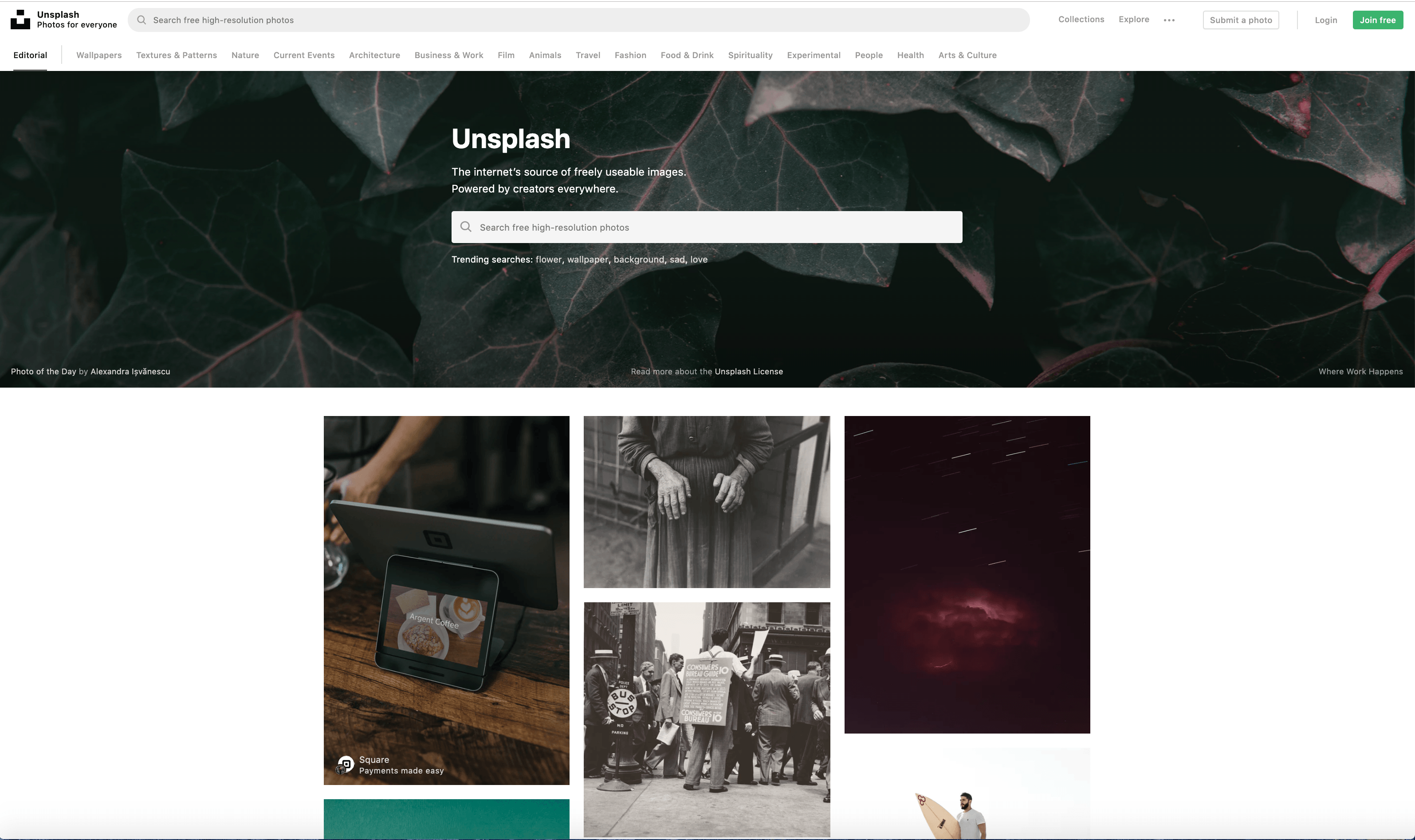
Unsplash is your trusty supplier of royalty-free stock photos.This website is where photographers can share high quality images that are free for commercial use. With a growing library of over 800,000 photos, you’ll most likely find what you need. Use this as an additional resource when using the previously mentioned tools, and you’ll be in great shape.
Putting the tools to use: Design basics
Whether you are creating Louvre-worthy still images or stylish video content, here are a few key tips to keep in mind across the board:
The psychology of color
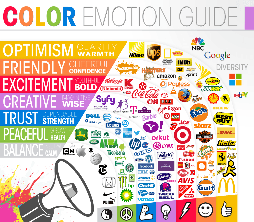
Choosing the right colors for your brand can be challenging. Lucky for you, there’s a plethora of research on color theory and how color influences our behavior and decision-making. A good place to start is by picking a color or color palette based on your brand personality. For example, yellow is perceived as the happiest color in the color spectrum, while green is often associated with prosperity. It’s also important to be aware of the common misconceptions and cultural differences surrounding color. Then, ask yourself, what is the emotional message you’re trying to convey with your brand or product?
Typography
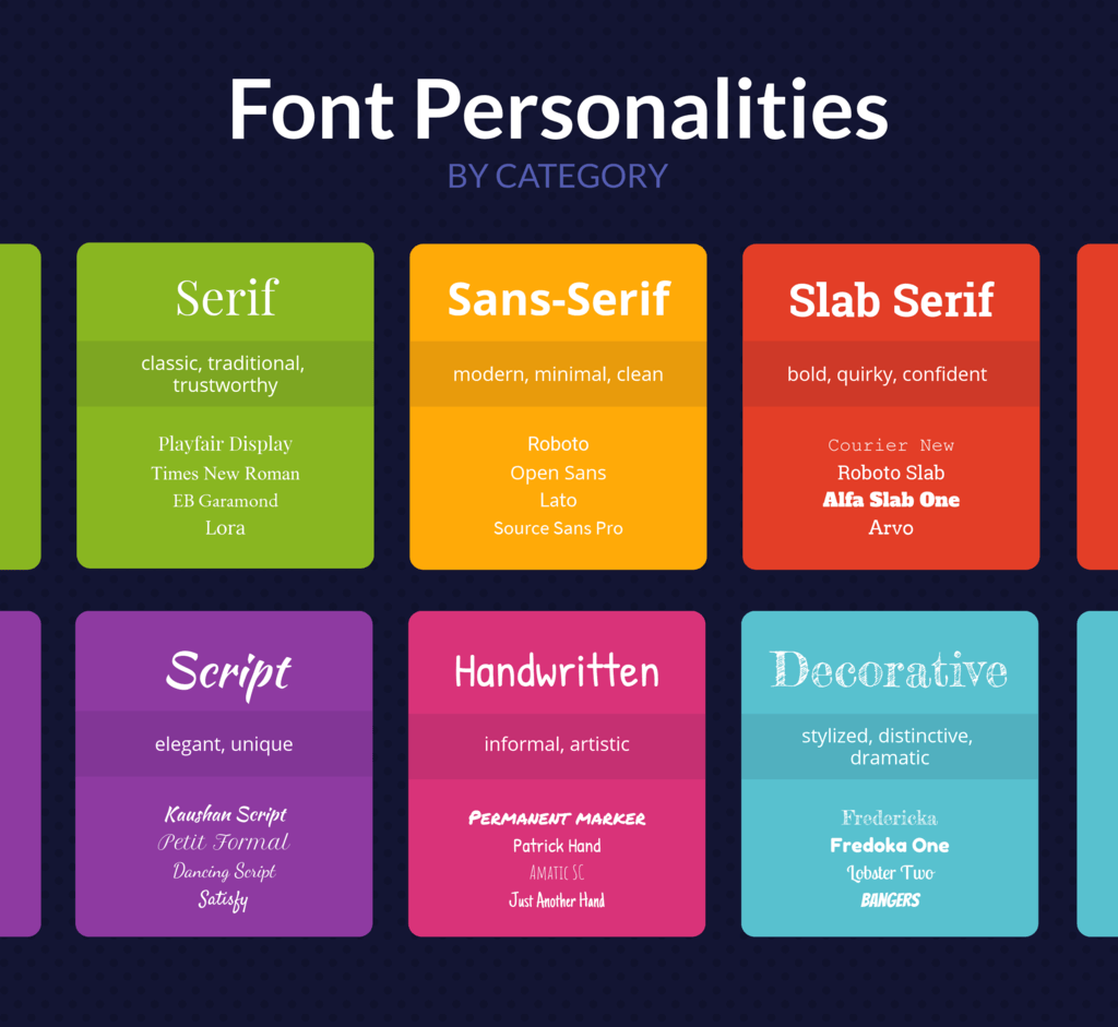
One of the most important aspects in the design process is to ensure that any text you use is not only pleasing to the eye, but also easy to read. If you’re working within Canva, they created 20 unique font combinations within their platform to make it easier for you to choose the best typeface for your brand. Like color, fonts can be very expressive. Knowing your brand personality will make this process easier as well as getting to know the personality traits of each font category:
Stay consistent
Staying consistent with your designs will help your customers recognize your brand. Regular use of the same fonts and colors will make the visual experience of your brand feel more uniform and professional. This is why your main message and brand identity is an important thing to lock down before you pick up a single electronic paintbrush tool.
Keep it simple
People have short attention spans. No one wants to spend extra time deciphering whether that F is actually a T on your graphic, or trying to make sense of cluttered text and images in a tiny 3 x 3 icon. The less busy, the better.
Here’s an example from our The State of Subscription Business infographic:
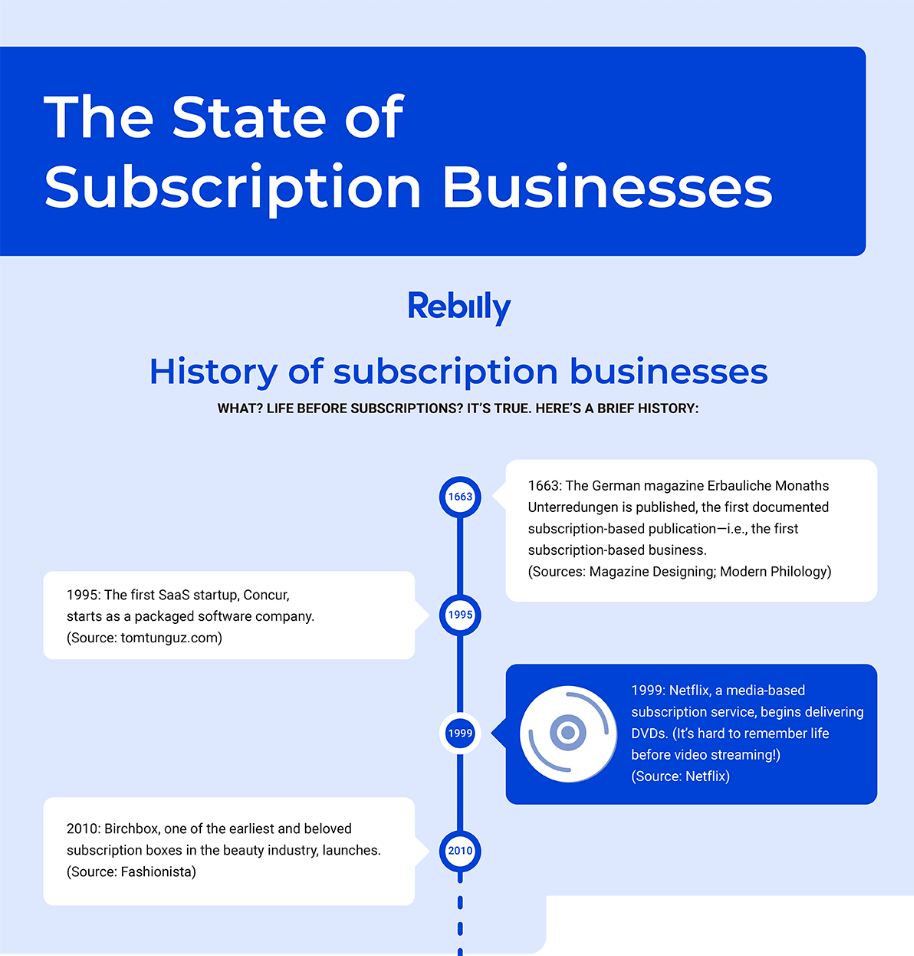
There are several elements that allow this part of the infographic to display a decent amount of information without looking too busy or crowded:
- The contrast between light and dark colors make the text “pop”.
- Alternating text boxes on each side of the timeline.
- The lines help direct the eye and give a sense of movement.
- Enough negative space between each element.
Have fun
Making art should be enjoyable and give you little to no gray hairs. Don’t be afraid to experiment and play around with these tools until you get the hang of it. If you make a mistake, there’s always the “undo” button. There is no singular blueprint for choosing the right design but as long as you keep your brand identity in the forefront of your mind, you’re ready to start creating!
Now that you’ve got a handle on how to DIY your design, make sure the rest of your business boxes are checked. Check out our Six-Month Success Checklist and get the tips and resources you need for your subscription business. Download it today and set yourself up to win:

